 Jatin Sharma
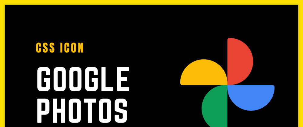
 I will create the Google Photos icon in this article using CSS only. Let's look at how we do that.
Problem

Solution
Video
First, we need to create the structure for this logo then we will style that structure.
HTML
<div class="wrapper">
  <div class="yellow"></div>
  <div class="red"></div>
  <div class="green"></div>
  <div class="blue"></div>
</div>
CSS
.wrapper {
  width: 200px;
  aspect-ratio: 1;
  display: grid;
  grid-template-columns: 1fr 1fr;
}

.yellow, .blue {
  width: 100%;
  height: 55%;
}

.red, .green {
  width: 55%;
  height: 100%;
}

.yellow {
  border-radius: 1in 1in 0 7px;
  place-self: end;
  background: #fbbc01;
}

.red {
  border-radius: 7px 1in 1in 0;
  background: #ea4132;
}

.green {
  border-radius: 1in 0 7px 1in;
  place-self: end;
  background: #069e57;
}
.blue {
  border-radius: 0 7px 1in 1in;
  background: #4086f4;
}
Codepen
Wrapping up
If you have any queries, feel free to drop a comment below. This is a series of CSS Icons so make sure you follow for more such articles. If you like this then don't forget to ❤️ it. And I'll see you in the next one.
🌐 Connect with me:
Twitter
Github
Instagram
Newsletter
LinkedIn
Website
Buy me a Coffee