 Stas Melnikov
Hey folks!
I'd like to talk about why column-gap is better than justify-content, how justify-content: center and align-items: center lead to the loss of elements, what means flex items are blockified!
But before embarking on reading I leave the link on my Substack newsletter about CSS. You know what to make 😎
Also, thank you so much, my sponsors: Ben Rinehart, Sergio Kagiema, Jesse Willard, Tanya Ten, Konstantinos Kapenekakis. I didn't write this article without their support.
Let's go!
justify-content vs column-gap
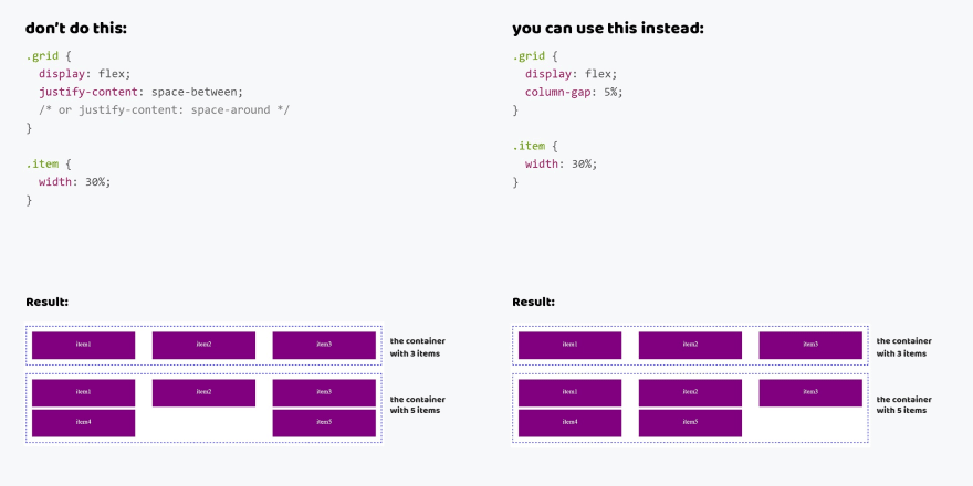
I'm tired to see that developers use the space-between or space-around value to position the grid's elements. It's a bad practice that leads to incorrect displaying. When people do that they don't think that number of items may be changed.
For example, if add more elements in a grid from 4 columns they will not be displayed at the start of the line. Thus I see the broken grids.
There is a nice approach using the column-gap property. This property with Flexbox and you can just define a gap between of elements. And browsers will do all the rest of the work. So you'll get safe grids with any number of elements.
don't do this
<div class="grid">
  <div class="item"><span>item 1</span></div>
  <div class="item"><span>item 2</span></div>
  <div class="item"><span>item 3</span></div>
  <div class="item"><span>item 4</span></div>
  <div class="item"><span>item 5</span></div>
</div>
.grid {
  display: flex;
  justify-content: space-between; /* or space-around */
}

.item {
  width: 30%;
}
You can use this instead
<div class="grid">
  <div class="item"><span>item 1</span></div>
  <div class="item"><span>item 2</span></div>
  <div class="item"><span>item 3</span></div>
  <div class="item"><span>item 4</span></div>
  <div class="item"><span>item 5</span></div>
</div>
.grid {
  display: flex;
  column-gap: 5%;
}

.item {
  width: 30%;
}
justify-content and align-items vs margin: auto
When we solve issues of alignment we like to use alignment properties such as justify-content or align-items. But few people know these properties can lead to losing data, particularly frequently, when vertical alignment.
This is due to how these properties work. This process includes the two terms. The first, the alignment container is an element to that you declare the alignment properties.
The second, the alignment subject is elements that are inside of the alignment container. The alignment properties affect them.
So there is the case when the alignment subjects' sizes are larger than the alignment container's sizes. In the default alignment mode, it'll lead to overflow and loss of data. So users will see the cropped element.
I created the example with the modal element to show this behavior. At first, the text is short. But when we make it more we lose the heading and the close button.
We can fix it using auto margins because it uses extra space to align elements and doesn't lead to overflow. Take a look at how elements are no longer lost.
don't do this
<div class="modal">
  <div class="modal__main"></div>
</div>
.modal {
  display: flex;
  justify-content: center;
  align-items: center;
}
You can use this instead
<div class="modal">
  <div class="modal__main"></div>
</div>
.modal {
  display: flex;
}

.modal__main {
  margin: auto;
}

flex items are blockified
There is an important feature when we use flexbox. When you write display: flex for the element all its child elements (flex items) are blockified.
What does it mean? All flex items that are set the display property with the inline, inline-block, inline-flex, inline-grid or inline-table values will be changed. The inline and inline-block will changed to block, inline-flex -> flex, inline-grid -> grid and inline-table -> table.
So don't use the block, inline and inline-block values and your code will be saved clear.
don't do this
.grid {
  display: flex;
}

.item {
  display: block; /* inline or inline-block */
}
You can use this instead
.grid {
  display: flex;
}