 Matthew Collison
If you want to browse / duplicate the design or see the CodePen, check the bottom of the post
Our recent Instagram poll & DM’s regarding how developers feel with design highlighted something to us; most developers feel really uncomfortable with design.
With 93% agreeing, we think it would be a good time to help you all out with some beginner design tips, starting with some solid principles to better shadows.
The Purpose of Shadows in UI Design
Shadows are there to improve the overall general feel of things, and add levels of depth and realism to the user’s visual experience.
Because of this, shadows should
- Simulate real world light dynamics such as direct and ambient light
- Not be so prominent that they are a distraction. They should effectively blend in.
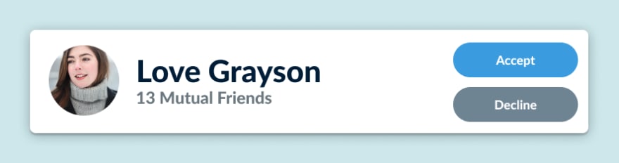
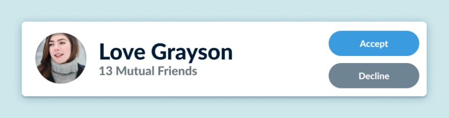
The following design definitely violates those two principles:
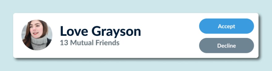
On that note, here are the 4 actionable tips for you to implement in any UI shadow design in your projects, and we'll show you how they add up each step of the way
1) Simulate Direct Light With A Hard (non-blurry) Shadow
Direct Light is light from one source shined directly on an object.
For example: When the sun is out, there will be a hard, defined shadow on the other side of every object. This is direct light casting the hard shadow we’re talking about
If we add direct light to our card, it would look like this:

2) Simulate Ambient Light With A Soft (blurry) Shadow
Ambient Light is light that bounces off all the surfaces around us.
For example: When the sun is hidden behind the clouds, you won’t see any direct light shadows, but if you look under trees, you might see a very soft, shaded area underneath them. This is because there is ambient light in the area, and this causes soft shadows.
If we add ambient light to our card, it would look like this:
3) Simulate Surface Shadows By Using A Similar Color To The Component Underneath
This is a bit of a trend at the moment, and it also gives another level of realism to your design - in the real world, things don’t just get “blacker” when a shadow is cast on them, they become a darker shade of the colour they already are.
So in that case, we colour-pick the background and make it a much darker and more saturated shade of the colour. Here’s how it looks:

It's a very subtle change by itself, but this in conjunction with all the other tips stack together to make for a great UI shadow.
4) Use Medium-Soft Inner Shadows On User Generated Images
User-generated images such as profile pictures or any other form of uploaded image will sometimes have colour that is similar to the background it’s on.
Here's a little comparison of how the profile picture looks with and without an inner shadow:

The Final Product
This looks much better than what we started with:
We Coded This Up
Here's the CodePen if you're interested - feel free to steal this and use it in any way you want (it looks much better if you press "Edit With CodePen" because it's not responsive):
Get The Design File
You can click here to be taken straight to Figma - feel free to duplicate it and make it your own. You don't need to attribute us, we can't afford lawyers anyway!
Curious about frontend development? We’ve just released a free crash course (No, it’s really free - no upgrades, no hidden costs)
We worked for a couple of months on a professional design and 4 hours 20 minutes of video content to bring you our free crash course showing you how to code this portfolio website (which we constantly encourage you to customise to your own style)
If that’s something that would interest you, and you’d like to learn more about HTML, CSS, SCSS, Bootstrap 4, Git, GitHub Pages and a sprinkle of JavaScript and jQuery, you can register today, for free, from this link here.


