 Ryland @ Stackbit
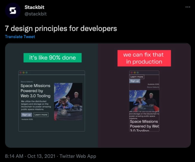
Ever said this? And then have that happen?
Yeah, me too. lol
Here are 7 tips to help.
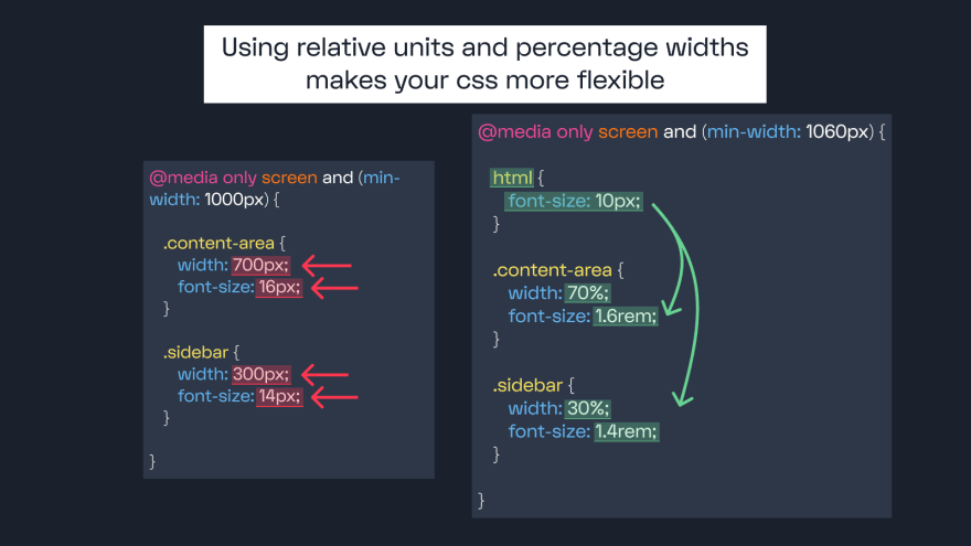
1/ Use Relative Units & Percentage Widths
Using em, rem, and percentages helps your CSS styles flow across screen sizes.
ex: If you need to change a breakpoint, your widths work across the board. And your font-sizes can change by simply changing the element's font-size.
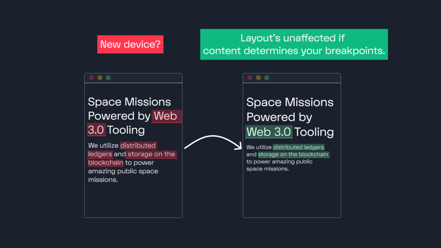
2/ Content (not device width) determines breakpoints
You don't want to end up in this loop: New device, new media queries, new device, new media query...
To keep that from happening, here's what you do:
Base your breakpoints on the natural qualities of your content. As screen size increases, pick where it’d be better in a new formation
Boom! Breakpoint.
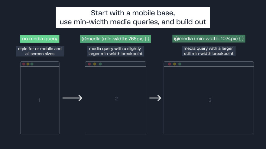
3/ Use min-width media queries
Using min-width ensures that mobile styles get loaded without desktop styles mixed in.
This can significantly improve the mobile experience and your site's SEO.
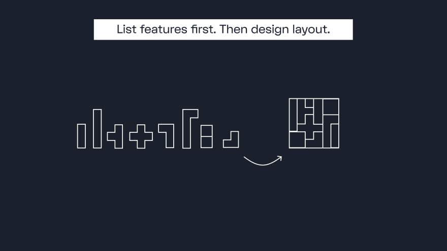
4/ Start by listing features, not designing layout.
If you’re building a cheap flights site don’t ask: “Should this item be on the left or right?”
Instead ask: “What will our users need?”
Write out items like a datepicker, input field, search button, etc. Then piece them together.
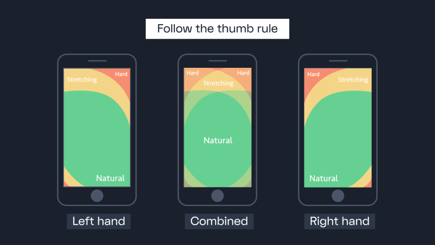
5/ Follow the thumb rule
75% of people use their thumb to operate their mobile device. Place key actions where it's easily accessible.
💚: Easy access = Most important elements
💛: A small reach = Secondary elements
🧡: Takes effort = User always notices
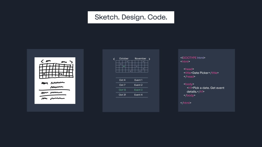
6/ Sketch, Design, Code.
Sketch first, always. Notice how the sketch is rough and details are left out. It gives room for interpretation on a design tool.
But it’s also specific. It’s very clear how it works, what needs to be built, and what doesn’t need to be built.
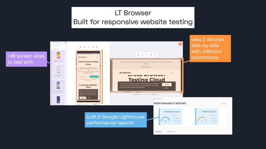
7/ LT Browser
The LT Browser was made specifically for testing website responsiveness.
✅ +45 screen sizes to test on
✅ Built-in dev tools for debugging
✅ Network throttling testing
✅ Local testing
✅ Google Lighthouse performance reports
How am I hearing about this now!?
Big thank you to the folks quoted here.
Luke Wroblewski: Mobile First Book
@adamwathan
Steve Schoger: RefactoringUI
@chriscoyier
: CSS Tricks
@dhh, @jasonfried: Shape Up Book
And that's it!
--
If you found this helpful, let me know by liking the tweet thread on Twitter. 💖🙏